
Step-by-Step UX Improvement: Project Screenshots
Series: work log July 18, 2013
I’ve been playing the role of UX fairy on my current project at work this week — I go around the app, sprinkling little bits of small improvements.
I thought it might be useful to document some my decisions and reasoning.
Background: The app tracks company projects (who worked on them, what technologies were used, etc). A new feature was added recently to allow for project screenshots to be uploaded and displayed, but it could use some UI/UX love.

Scenario: A project with no screenshots
Observations:
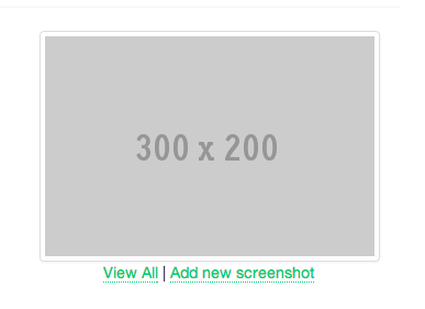
- The stock image for placehold.it that was left from development
- View All link takes user to an empty page that says “No screenshots for this project”
Tweaks:
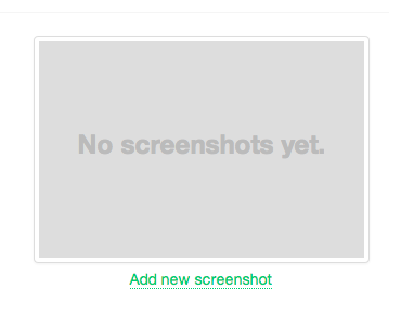
- Remove hot-linked placeholder with basic styled text; I can’t photoshop my way out of an Adobe-brand paperbag so I have to stick to text instead of making a better placeholder image
- Add conditional to not render View All if there are no screenshots to prevent the user from performing an “empty action”
Scenario: A project with one screenshot
Observations:
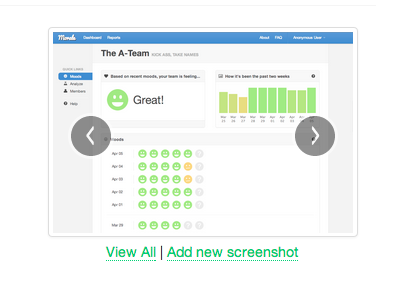
- Carousel arrows are shown but don’t do anything since there is only one image
- Inconsistent casing on user actions (each word capitalized vs first word only)
- Use of black
|pipe instead of gray·dot does not match rest of the app
Tweaks:
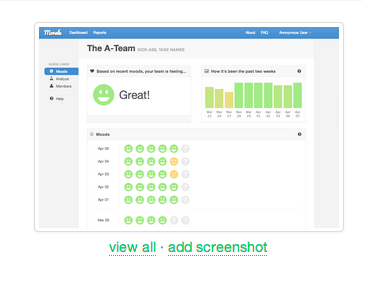
- Use Javascript to hide carousel controls if there is only one screenshot
- Change user action text to be consistent (we use lowercase throughout the app) and more terse
- Swap in dot separator
Scenario: A project with multiple screenshots
Observations:
- Everything looks pretty good!
Final tweaks
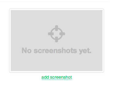
- I added a screenshot icon to the placeholder using FontAwesome for a little bit of visual flair
Compared the before and after, had a teammate give it a quick once over, and pushed the changes to master. While doing this, I noticed that there isn’t a way to remove a screenshot, so I added a work item to implement this feature.
Overall, I am pretty happy with the changes — it feels like a good balance between time and improvement. All in all, it took about 30 minutes (less than the time it took to write this post). It’s nothing ground-breaking but making small improvements constantly helps keep the UX tight and gives other developers good examples to reference.
Hopefully this was helpful! I picked up most of this stuff from working with others that had a good sense for design and playing around with it on my own, but there are certainly some common patterns that are generally applicable.
If you liked this format, let me know on Twitter and I’ll write up a few more.