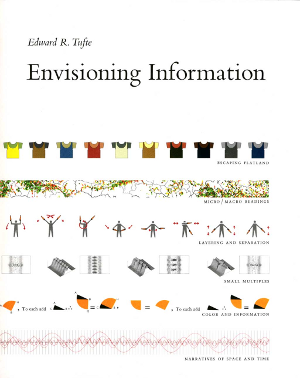
"Envisioning Information" Book Writeup
December 05, 2010
What’s the point? The book is an exploration of how to best present visual information in a variety of mediums. The book covers six main topics and presents examples of each idea. I chose to read this book because I thought it could be helpful in thinking about graphs and visualizations in a new way.
How was it? I found it to be kind of a letdown. The book is very highly regarded and considered a “classic” so my expectations were high and maybe that was the problem. The book was definitely interesting and the examples are really cool, but I don’t feel like I was able to take away that much information that can be used in software.
The section Layering and Separation was most useful, as it demonstrated
solutions to making grid-based information easier to parse and interpret. I
also liked the discussion of negative margins and how 1+1=3 or more. Some
of the other sections (like the map/cartography related ones) were certainly
interesting, but I didn’t really take away anything that useful.
Who should read it? The book is skewed more towards designers, but it is a quick read (lots of pictures and under 200 pages). I would recommend it to a developer with an interest in design or information visualization. Make sure you read it in print though, since I don’t think the images would work as well in a digital format.

