
Step-by-Step UX Improvement: Screenshot Upload
Series: worklog July 24, 2013
My last post detailing the step-by-step process I use to make UX improvements was well-received so here is another walk-through for a series of small changes to my current work project.
Background: The app tracks company projects (who worked on them, what technologies were used, etc). A new feature was added recently to allow for project screenshots to be uploaded and displayed, but it could use some UI/UX love.
Today, I am going to be working on the upload page for screenshots. Screenshots have three components: the actual image, whether it is public or private, and an optional caption.
Starting Point
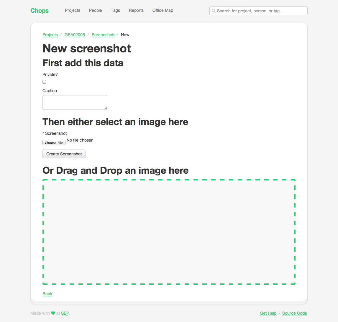
It is pretty rough around the edges — but I will say it is completely functional and works great! It’s just kinda ugly.
Observations:
New screenshotheader is unnecessary; the user just clicked the link to add a new screenshot and this is also shown in the breadcrumbs- The checkbox from
Private?is on a new line (this is very common in Rails apps because of how the form builder works) - The input order is weird; I have to write a caption and pick the visibility before I pick the image
Tweaks:
- Remove
<h1>tag, expand breadcrumb to “Add new screenshot” - Make the
Private?checkbox inline - Swap the order of inputs (picking image first)
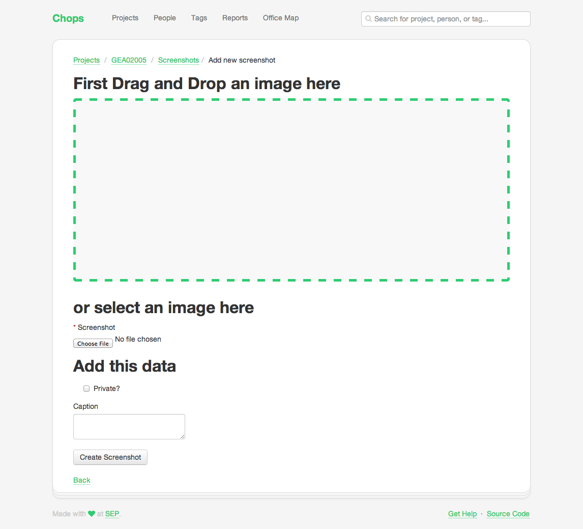
I particularly like the ordering after this change. The most important part of a screenshot is the image and it is right at the top. The visibility is more important than the caption (which is optional) so it comes next.
Observations:
- The drag-and-drop landing area is way too big
- Having the file inputs stacked vertically is confusing — do I drop and then browse? Why are their two inputs for one field?
Drag and drop an image hereisn’t great copy and doesn’t follow other conventions I’ve seen (text inside the landing area)
Tweaks:
- Shrink landing area drastically
- Move drag-and-drop text inside area
- Change file inputs to be side by side with clear indication that you can drop or browser, not both
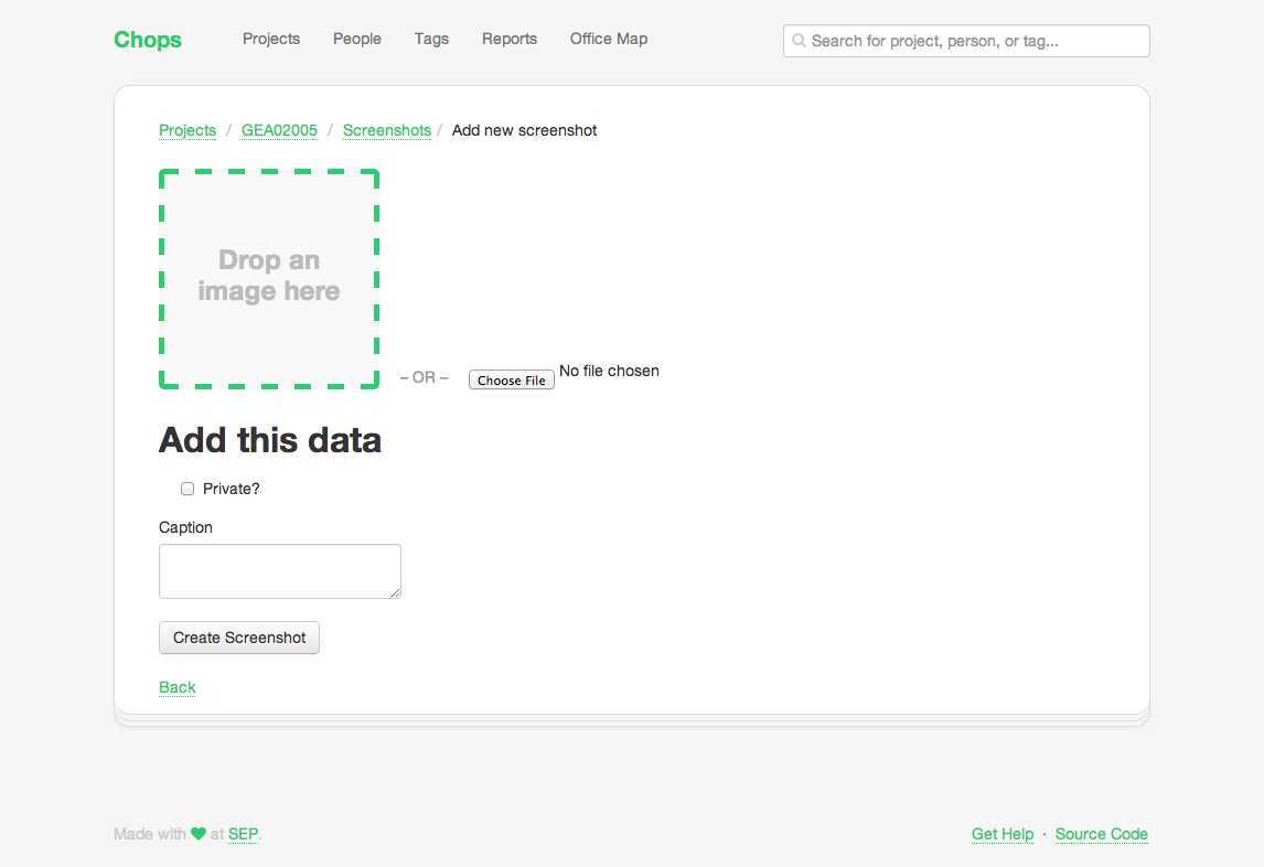
Observations:
- The form fits above the fold! Victory!
Add this datais redundant. It is obvious that form fields need to be filled in.- Button does not match the styles in the rest of the app (smaller, grey background)
- Caption is supposed to be a short description, why is the field multiline?
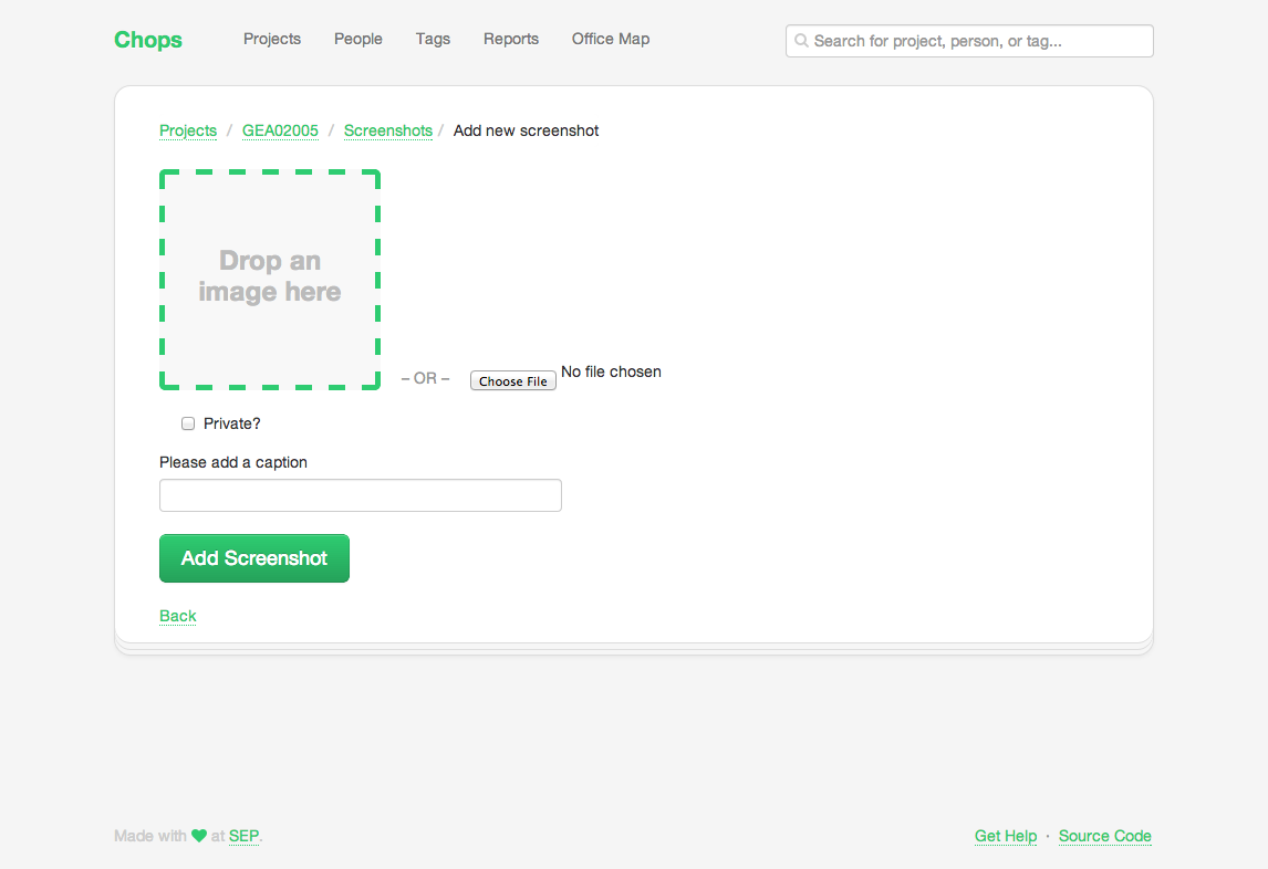
Tweaks:
- Remove redundant text
- Apply correct
btn-primaryclass to the button, tweak copy - Change caption to text
<input>instead of<textarea>, tweak copy
Scenario: Beginner Mindset
Think about the user time a new user lands on this page.
Something that jumps out to me is the Private? checkbox.
Everyone on the project knows what Private? means but a new user
probably won’t. This needs some explanatory microcopy.
The private flag determines whether or not an image is “safe” to show to the general public. Sometimes we do client work that we can’t talk about (NDA, export controlled, etc) so we don’t want to accidentally use that data in marketing materials.
I also think about the target user. Most of the time, the person adding screenshots is a project manager or developer. But sometimes it could be an intern or a newer developer that doesn’t know what is or is not “sensitive client information”, so we should accommodate them as well.
Here’s what I came up with:
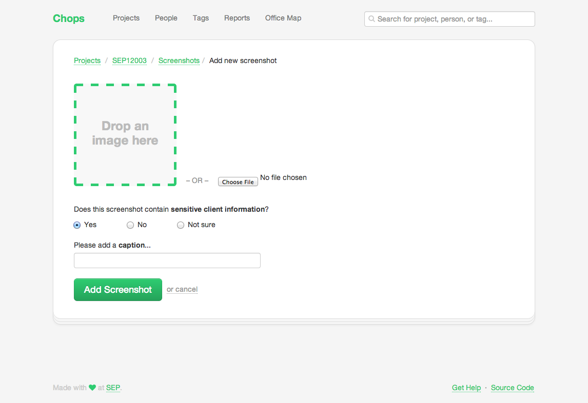
Succinct microcopy that asks the real question we want to know and
an extra Not sure option (defaults to making the image
private).
I also swapped the Back link (another silly Rails default) to a
muted cancel link next to the create button. This is more of a
personal preference, but I think it feels more natural.
And there you have it, a bit more polish to the screenshot upload page. I think the interesting lessons here are:
- Be deliberate with microcopy to better engage users
- Think of the importance of fields when ordering a list of inputs
- Try using your app with a beginner’s mindset
Hope this was helpful, let me know on Twitter if you’d like me to keep doing more writeups in this format.