
Delightful UX: Medium's Time to Read
Series: delightful products July 04, 2013
Medium recently implemented a simple feature that I think is really great.
At the top of every blog post, there is a blurb telling you how long the article will take to read — this post is a “3 min read” or a “12 min read”.
As soon as I noticed this, I smiled.
The implementation is probably trivially easy, something like:
def minutes_to_read(post)
  (post.word_count / AVG_WORDS_PER_MIN).round
end
But what it shows is that Medium has a deep understanding of how people consume blog posts.
Do you ever glance at the scroll bar to see if a post is a huge essay or a quick hitter you can read while your code is compiling? Because I do all the time. And I’ve never seen this “Time to Read” feature on any other blog platform.
Additionally, it keeps readers on Medium for longer — even if you are only mildly interested in an article, if you know it’s only going to take 2 minutes to finish, you’ll stick it out. Since Medium’s whole vision seems to be centered around high quality content, preventing a sub-10 second bounce seems worthwhile.
Newer models of the Kindle have a similar feature: using your past page turning speed to predict when you will finish your next chapter (or even the whole book).
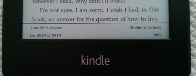
Kindle users reap similar benefits — I can decide to pause reading for the night or press on a few more minutes to reach a natural stopping point at the chapter break.
And Amazon benefits from me seeing that I have only 20 minutes left in this book, but eight days of vacation left — time to go order a new book.
It’s a small thing, but the sum of small UX delights leads to a great product.
Have you seen any other small bits of awesome UX lately? Hit me up on Twitter, I’d love to hear about it.
By the way, this post should have taken you 2 minutes to read.