Interview to Implementation: Horizon Report
Series: worklog August 07, 2013
We recently added a new report to my current project at work. I am very picky about what reports we add to this app — a stance shaped by working on a project with an entire “Report Builder” that could generate tens of thousand of report combinations.
So I thought I’d share some of my process.
Background: The app tracks company projects (who worked on them, what technologies were used, etc). Employees can also list technologies that interest them and record external projects that they have worked on (personal projects, open source, past job, etc).
My basic process goes like this: expose some data, let the end-user play around with it, talk to the end-user and find out what questions they want answers to based on the data. If those questions are compelling, create a report to help them answer said questions.
Interview: Mike, our biz-dev champ
I had Mike poke around the app for a few days and I blocked out an hour of time to talk with him about what kind of questions he wanted answers to from the app. We came up with four main questions and then pick the top two to dive deeper - one of which was what we called the “horizon report”.
Mike wants to know what kind of work would be interesting to the employees when he is pursuing new opportunities. If Mike knows that a lot of people are really excited about Arduino or RubyMotion, he can spend time pursuing those projects.
I like Mike :)
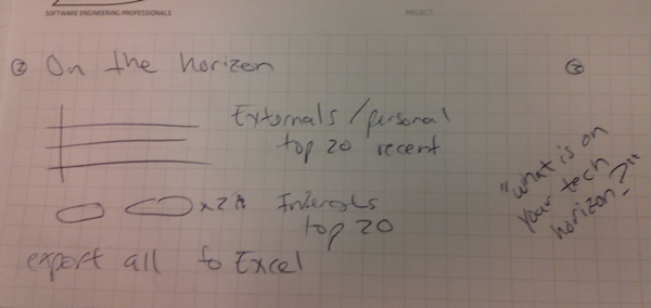
During our meeting, I tried to get Mike to tell me stories or examples to illustrate the need for this data. Sometimes, you both realize that there aren’t any actual use-cases for a report (other than “we have data, therefore REPORTS!!”). Mike talked about how he has made an effort to find more Ruby projects because he knows several engineers are interested in it, but he had to spend a lot of time talking to people to find that out and it was a small sample size (4-5 engineers out of 100).
While Mike was talking, I tried to sketch out some notes using a weird shorthand that combines bullet points and UI mockups. I tend to avoid doing full blown mockups at this time, because people get too bogged down in the details at this stage. No reason to spend 15 minutes deciding on which columns to display or what the button text says right now.

Mockup: What the heck did I write?!
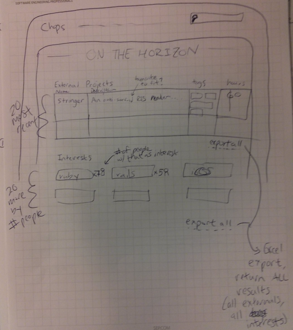
When I got back to my desk — with the interview still fresh in my mind — I did a quick mockup. It is a good thing mockups are supposed to be “rough looking” because I’m not great at drawing!

My main goal was to make sure I captured the key features from the interview and translated them from my shorthand into something I could give to another developer (or a future version of myself).
I like to make notes on function, rather than graphics. I try to preempt questions like: what should happen if this field is really long? how many results should we show? how should this be sorted? You can see some examples of that above.
Mike was too busy for a quick look at the mockup, but I was confident it was pretty close based on our interview. When I had questions, I could always refer back to the purpose of the report (“what is on the ‘tech horizon’ for our engineers?”) and make a decision based on alignment to that purpose.
Implementation: From paper to pixels
I passed off the mockup to Jackson (another developer on the team) and he cranked out the report in a few hours. It was smooth sailing with the annotated mockup.
After seeing it in the app, we made a few tweaks (swapped the “Interests” and “External Project” sections, show Top 21 vs Top 20 so it would fill the three-column grid evenly), but overall, the report is pretty close to the mockup.
Circle back: Make sure you got it right
We pushed out the feature and I grabbed Mike to take a quick look, he gave it the thumbs up. A happy user!
I set an Outlook reminder to ask Mike if the report has been helpful for 60 days in the future. If it isn’t useful, I will try to kill it or fix the problems.
Summary
- Don’t get bogged down by details when talking to a user/customer
- Make sure there is a clear purpose for a report, don’t just build it because you have the data
- Think ahead to what questions you might have during development and try to answer them on the mockup
- Be deliberate about getting feedback once a feature has been in use for a bit. Kill failed features ruthlessly.
It was fun to go soup-to-nuts on a feature. Sometimes working just at the development level makes your forget that there isn’t some magic machine that spits out specs and mockups. I encourage all developers to try shepherding a feature from end-user to “shipped” every once in a while.
If you liked this format, let me know on Twitter and I’ll try to write up a few more.
