Engineering a First Run Experience
Series: delightful products August 10, 2013
First impressions are important. I spent a lot of time thinking about the first run experience for Stringer, my RSS reader.
It starts at the source
Stringer is an open source project and you self-host your own instance of it. So the first run really starts before someone even installs the app. It starts on the GitHub page.
I wrote about it in more detail before, but on GitHub the README is
everything. It is like the landing page of a traditional product. You need a
clear value proposition, screenshots, and a call-to-action (in this case,
git clone and deploy to Heroku).
The installation instructions should be kept as concise as possible, while still being thorough. If the user can’t get the app up and running without problems, they are likely to just bail. Run through your setup instructions from a clean slate, multiple times if you need to.
Onward to the actual app!
Require the minimum amount of input
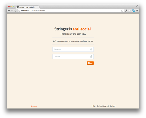
Most apps start off with registration. You can experiment with a demo mode or some kind of trial account, but I prefer to just ask for the minimum amount of information up front and fill in blanks as you go.
For Stringer, the minimum thing I need is a password. Originally, I asked for an email address, but since Stringer is a single-user app, there is no need. If I were to go back, I would kill the password confirmation too. 95% of the time, the confirmation will match and if it doesn’t they can always reset the password.
The first page also sets the tone of the app — for Stringer, this means short, to-the-point copy and an emphasis on the opinionated decisions of the app.
Welcome aboard
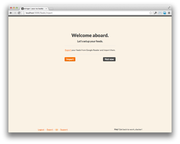
As you can imagine, the next piece of information I need is the list of RSS feeds you want to read. The target audience for Stringer knows what an RSS feed is and is comfortable with technical language like “importing”. Tailor your on-boarding language to the end-user.
There are some small touches that improve the user experience here. 90% of the users were coming from Google Reader when the project launched, so there is a direct link that, when clicked, will export your Google Reader subscriptions (assuming you are logged in). I should probably change this now that new users might be coming from Feedly, Newsblur, etc.
Another noteworthy item is the “Not now” button. Give the user a way to skip through any steps that aren’t strictly necessary — just make sure you give them a way to add the information later on.
Time to delight
So far all of this stuff is kind of standard, but now I can really turn on the magic.
You might have heard about the “blank slate” or “empty state” of your app, right?
Basically, we usually think about how the app works when there is data in it. For an RSS reader, this means you have a bunch of subscriptions, a bunch of stories, some things are read, some are unread, the user knows what all the buttons do.
This is because, as a developer, you spend most of your time working on the app with all the data loaded in. But for the user, they are starting from scratch.
It would be great if the first time you open up Stringer, you see your stories. It lets you know that everything is working and you can dive in right away. But there is a problem. It takes some time to parse all of your feeds to load in your initial stories.
I could just let the import page spin for 2 minutes while the app pulls down all your feeds, but that is a poor experience. Instead, I can fill that time with something useful, like explaining how the app works.
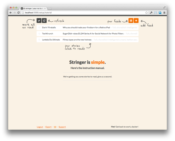
I added a background job to start parsing the imported feeds and then take the user to an interactive instruction manual. Turn a technical problem (feeds take a few minutes to parse) into a delightful experience (play around with sample stories).
This page was really fun to create. I drew some arrows and used a handwritten Google Web Font to create the annotated layover. This is a fun way to show the user what all the buttons do and only took about an hour to implement.
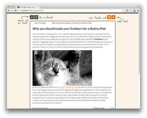
Notice the sample stories. They are cheeky little parodies of the type of feeds that would be popular among Stringer’s target audience (tech-savvy readers).
And everything works just like the real app, you can open a story, use the keyboard shortcuts, click the other buttons. When you open a story, it is filled with a few paragraphs of Hipster Ipsum (way better than Lorem!) and a kitten pic from Placekitten.
The bottom line is that I need to distract the user for at least 30 seconds so the app can fetch them some stories. But at the same time, I can teach them how to use the app and (hopefully…) make them chuckle at the fake headlines.
I used a simple setTimeout() JavaScript call to show a “Start Reading” button
after 10 seconds.
Now you’re in!
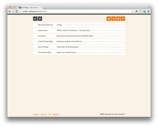
Now the user enters the app to find it already filled with stories. I made the decision to only grab stories that were published in the past 24 hours, it makes it faster to parse the feed and the user doesn’t end up with 500 unread items.
On the backend, I toggle a flag that the user has completed the setup, so that every time they use the app from now on, I take them straight to the news feed instead of through the tutorial again.
The time from cloning the repository to reading your own feeds on Stringer is less than 10 minutes. None of the setup seemed like work, I didn’t make the user link their Google Account or enter a bunch of feed URLs.
But more importantly, the user had a great experience setting up the app.


It is easy to focus on building cool features, but if you can’t get them past the setup, the user will never get to see any of your hard work.
Even though the first run only happens once, it can make or break your app so give it some love!

